Monday, 18 October 2010

ASA Banned Advertisement


1) When Oasis bought out their Cactus kid advert it aroused many issues, the campaign was banned by the ASA because it encouraged teenage pregnancy some people pushed their thoughts even further and said the young girl in the video did not even look sixteen. The advert did breach the code of advertising; because they were putting the thought in people heads that emancipation from ones parents is expectable. Furthermore people were outraged that the slogan allegedly encourages people not to drink water because the slogan in the advert said “For people who don’t like water” they thought coca cola were trying to substitute water for Oasis. Personally I did think this advert should be banned because it was weird and upsetting to see a mother lose her child to a cactus man.     

2) Actimel’s yogurt drink advert was banned for false advertisement. In the commercial a bottle of actimel is seen to be jumping over a skipping rope immediately after “kids love actimel and it’s good for them too” then the statement “scientifically proven” was stamped on the screen. The ASA ruled that the advert was misleading and broke to many rules because scientifically there was know evidence proven that actimel can support children’s defenses against disease. I am actually glad that this was banned because it is blatant false advertisement.     

3) Antonio Federici designed an advert to try and make all audience laugh; this advert displayed a nun eating vanilla ice cream in a church, with the strap line “immaculately conceived”. This campaign was banned because it mocked Roman Catholics believes. This campaign did breech the broadcasting code of advertisement because I was insensitive towards ones religion, In theory the creator just wanted to show his ice cream in a playful light, showing everyone that any can enjoy this ice-cream but the many people that sent their complaints in said this could have been done without insulting ones religion. Personally I do not think this advert should have been banned because I thought it was quite funny and depicted the joy of what people everywhere are missing out on if they have not had ice-cream in along time.  
Dominant/Subordinate Advert (Analysis)

John Lewis Ad 2010 - Fyfe Dangerfield 'She's Always A Woman'
John Lewis produced this advert, the dominant group, which appears in this advert, is a well stabled family, the issues they raise in this advert is that John Lewis can cater for your needs from the early age of 16 to the gentle age of 60. However the dominant ideology in this advert is the lovely fairytale life, teenage love, a wonderful marriage, the perfect place to live, growing old and loving each other. These are all dominant ideas, which are sadly a bit unrealistic considering half of marriages end in divorce; not all pregnancies are planned and finally the love of a marriage very rarely continues on until the old fragile stage. I think this was selected to show that if you purchase John Lewis’s products the ‘quality, service, price’ will have such a positive effect on your life it’s like they’re almost guaranteeing they can give you that fairy tale beginning and ending. They use the aspect of lifestyle to respond to the claim made about the perfect quality and service, they could also be trying to encourage that John Lewis’s products will last until you are old which makes them that extra bit better then normal products.
Nike Women Commercial
Nike produced this advertisement; the group, which appears in this advertisement, is a woman, portrayed in a very different light. In this advert the women was presented powerful and strong emitting a radiating ray of light, which could represent her glowing success. She was training acting slightly masculine going against are stereotypical expectations because we would not expect a women to act this way. I think this representation was selected to show if you use or wear Nike when training we can make you as powerful or even more powerful then a man, dominant views of women present them in a very week manor, this subordinate advert shows readers that with the right equipment women can be just as powerful as men, allegedly? They have used gender to respond to their audience possibly targeting females more because of a decline in sales.         

Wednesday, 13 October 2010

Media Awards (Analysis)


Night of a thousand lies

I’m going to focus on the main action code in this trailer which was when the villain according to Propp’s terminology, ‘Lexi’ privately approached the hero and forced him into intercourse, the act of dropping the ring signified betrayal because a marriage ring signifies togetherness and love and trust, and he broke that trust when the ring silently hit the ground to possibly indicate the affair had no effect on his heart. That was the one thing, which stood out to me from a Night of a thousand lies considering that was one of the ‘lies’ from the trailer.

Screwed

The disequilibrium in Screwed was very funny because there was no actually villain; there were just a lot of unfortunate things happen to the main character to disturb her natural equilibrium. For instance at the beginning of the trailer where the protagonist left her tampons at home, this is unfortunate, no one did this to the character, she did it to herself in addition when she was having her interview for the job she applied for and she went blank, no one did this to her it was just an unfortunate collapse of thought at time. This was something I decided to focus analyzing after I watched the trailer.  
  

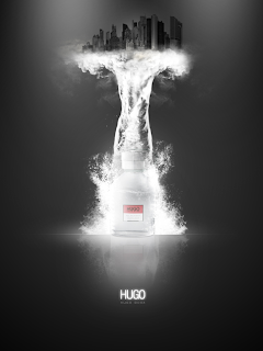
Advertisement Analysis (Hugo Boss)


This Hugo Boss advertisement promotes the fragrance in a very powerful way. There are more connotations then denotations, for instance one could easily suggest that the once wearing the fragrance it will give you power over the world, in addition I think it represents uniqueness in a very aloof way. The idea of the fragrance being separated from the city could suggest once wearing it you will be separated from everyone because of your distinctive and beautiful smell. The only colors used are white and black which are blunt commanding colors which depict the story of separation very well, it could show your smell shuns the world into darkness the Hugo boss sign is in red which is also a very masculine and powerful color which could connote the target audience are males.

The advertisement has been composed to create a horrific scene, the liquid representing the cologne could be twirling to frame a tornado, this could illustrate that the fragrance causes destruction when warn. To make the audience focus on the product only three other images have been used, drawing more attention to the Hugo boss sign. The images are small arranged accurately for effect.

The type of shot used is a medium shot, the subject of matter is the fragrance: creating a tornado shunning the world into darkness, and the tornado is the main feature of the advert. The settings vary, the photo’s look like they were taking using artificial light, the bottle of the fragrance has been edited to make it lighter and stand out amongst the page. 

Tuesday, 12 October 2010

Movie Analysis (Dance Flick)


The protagonist in this movie is Thomas the leader of a dance crew. The enigma codes are used very well as Dance Flick is a parody of all the latest dance movies put together, so they will manipulate a scene of another movie into something very humorous, this creates mystery as the audience do not know how the director has manipulated the original scene. Because this is a comedy movie the action codes used were very predictable at times, for instance, there was a scene were a character was hit by a car three times by three celebrities who had committed man slaughter by either drink driving or not focusing on the road. The character was first hit by; ‘Lindsey Lohan’ then ‘Halle Berry’, after that it was very easy for me to anticipate who was going to hit her next which was R&B singer ‘Brandy’ because she was recently (two years ago) prosecuted for hit and run. The linear patterns used by the director were very easy to detect because he used a similar middle to a 2006 dance movie called ‘You Got Served’, so it was easier for me to predict the end of the movie, which was a predictable dance of between the two crews. The movie had a very mulit-stranded narrative so they could incorporate other scenes from other movies to give it more of a comedic edge. There was no equilibrium because the harmony in the movie was constantly changing, however, the new equilibrium appeared at the end of the movie, which was quite a different outcome because their was no evil force it was just an opposing dance crew so when they lost it supposable restored order. Taken from Vladimir’s concept, the Hero was Thomas leader of the winning dance crew.